By Yvonne Rich
Paint color has a powerful effect on how a home feels the moment you walk inside. I work with homeowners in Napa Valley who are surprised by how much the right color choices can influence light, mood, and overall perception of space. Choosing paint isn’t about following trends; it’s about understanding how color interacts with architecture, layout, and daily life. When approached thoughtfully, color becomes one of the most effective tools for shaping a home’s experience.
Key Takeaways
- Color influences mood, scale, and flow from room to room
- Lighting and architecture should guide paint decisions
- Consistency matters as much as individual room choices
Start With the Home’s Natural Light
Letting light guide your color direction
Natural light is one of the most important factors when selecting paint tones. The same color can look entirely different depending on exposure and time of day.
- North-facing rooms often benefit from warmer undertones
- South-facing spaces can handle cooler or deeper hues
- Rooms with changing light need balanced, adaptable tones
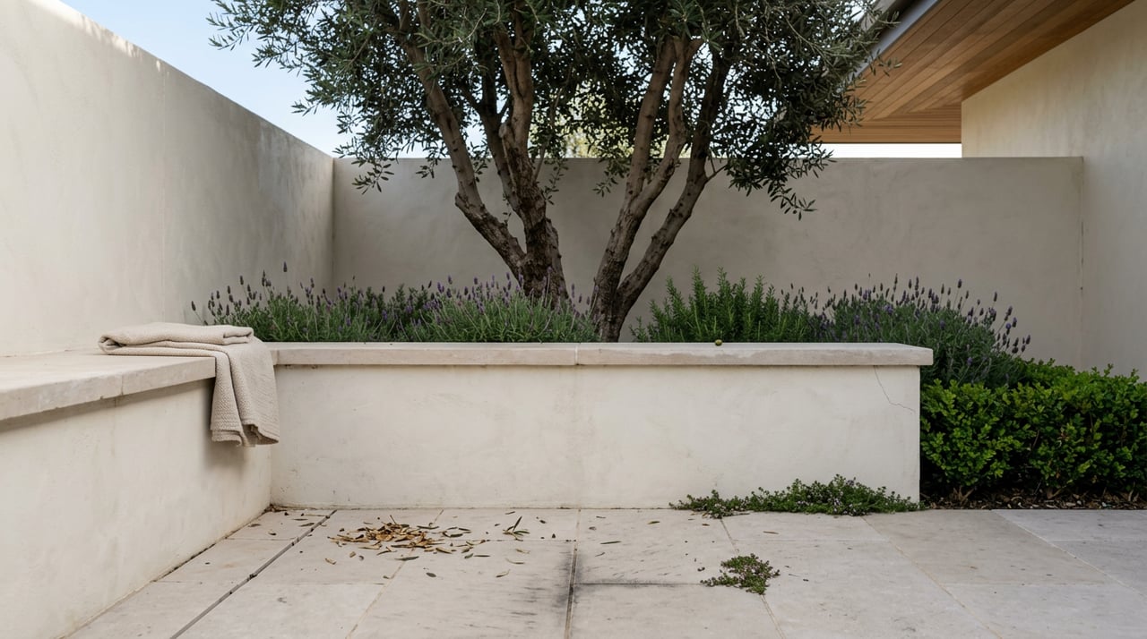
In Napa Valley homes, where windows often frame vineyards or hillside views, light shifts throughout the day. Observing how light moves through a room before choosing paint helps avoid colors that feel flat or overly intense once they’re on the walls.
Understand Undertones Before Choosing a Shade
Why undertones matter more than the color name
Many homeowners focus on whether a color is white, beige, or gray, but undertones are what truly define how a paint reads.
- Warm undertones include hints of yellow, red, or beige
- Cool undertones lean blue, green, or violet
- Neutral undertones balance both without leaning strongly
Undertones become especially noticeable when colors are placed next to flooring, cabinetry, or stone finishes. In wine-country homes with natural materials, undertones should complement wood, stone, and texture rather than compete with them.
Create Flow Between Rooms
Using color to connect spaces naturally
Color continuity helps a home feel cohesive, especially in open layouts or connected living areas.
- Choose a primary neutral that appears throughout the home
- Use tonal variations rather than abrupt changes
- Allow accent colors to repeat subtly across rooms
This approach helps spaces feel intentional rather than segmented. When homeowners ask how to choose paint colors for a home in a way that feels elevated, flow is often the missing piece.
Match Color Intensity to Room Function
Letting purpose influence palette
Different rooms support different activities, and color should reinforce that purpose.
- Living areas benefit from balanced, welcoming tones
- Bedrooms often feel best with softer, muted hues
- Home offices can support deeper or more focused colors
In Napa Valley, where homes often blend indoor and outdoor living, rooms that open to patios or views tend to feel best when paint colors don’t overpower the scenery. Subtlety often creates the strongest connection.
Consider Ceiling and Trim as Part of the Palette
Looking beyond wall color alone
Walls are only one part of the color story. Ceilings and trim influence how a room feels just as much.
- Lighter ceilings can increase the sense of height
- Consistent trim color supports cohesion
- Soft contrast adds definition without distraction
In homes with architectural detail, thoughtful trim choices can highlight craftsmanship. Ignoring these elements often leads to rooms that feel unfinished or unbalanced.
Use Accent Colors Strategically
Adding interest without overwhelming the space
Accent colors work best when they’re intentional and restrained.
- Feature walls should highlight architecture, not hide it
- Deeper colors work well in dining rooms or libraries
- Accents should appear elsewhere in the home for continuity
Accent colors are most effective when they support the home’s overall palette. This strategy keeps design choices feeling layered rather than scattered.
Test Colors in Real Conditions
Why samples are non-negotiable
Paint chips and digital previews can’t replicate how a color will look in your home.
- Test samples on multiple walls
- Observe color at different times of day
- View samples alongside furnishings and finishes
In Napa Valley homes, changing light and natural surroundings can dramatically affect color perception. Testing ensures confidence before committing.
Avoid Trend-Driven Decisions
Choosing longevity over novelty
Trends move quickly, but paint choices tend to last longer than expected.
- Neutral foundations age better than bold statements
- Timeless palettes support resale flexibility
- Personal taste should still fit the home’s architecture
When homeowners consider how to choose paint colors for a home that will still feel right years later, restraint and intention usually lead to the best results.
Align Color With Architecture
Respecting the home’s design language
Architecture should guide color decisions, not fight them.
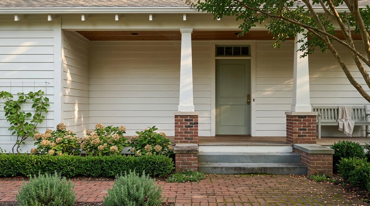
- Traditional homes often suit classic, layered tones
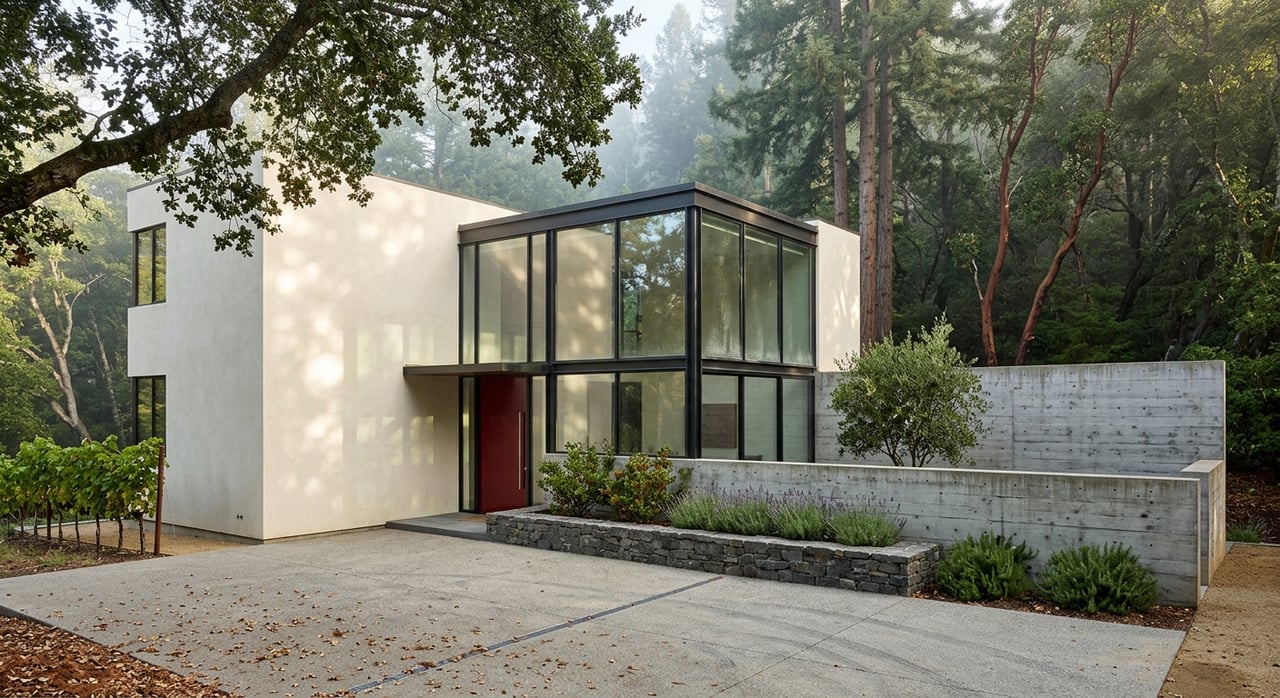
- Contemporary homes support cleaner, simpler palettes
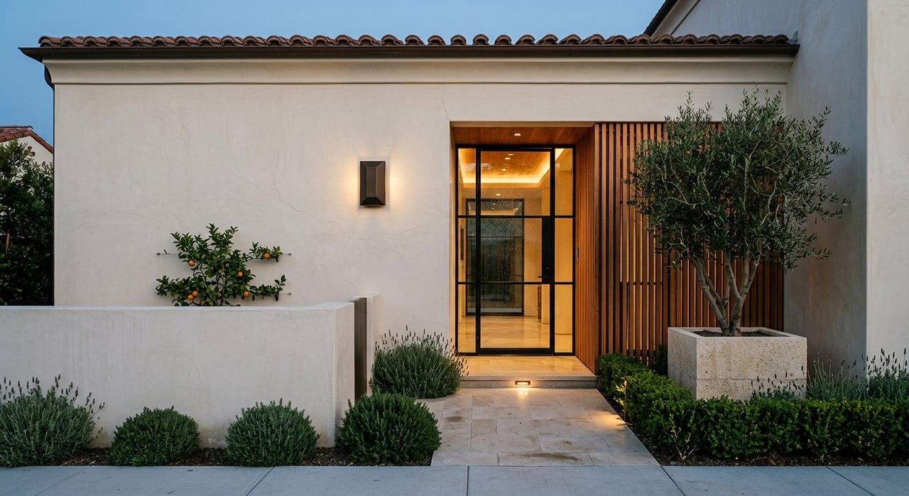
- Transitional homes balance warmth and simplicity
In Napa Valley, architectural styles vary widely, and color choices that respect those differences tend to feel more authentic and cohesive.
Think About the Emotional Experience
How color shapes daily life
Color influences how a space feels emotionally, not just visually.
- Warm tones create comfort and connection
- Cool tones support calm and clarity
- Balanced neutrals provide flexibility
Choosing paint with emotion in mind helps homes feel supportive rather than just stylish. This perspective often leads to choices that homeowners enjoy living with every day.
FAQs
Should every room in a home be a different color?
Not necessarily. Using related tones creates better flow and cohesion.
Do darker colors make rooms feel smaller?
They can, but when used thoughtfully, darker colors can also add depth and warmth.
Is white always the safest option?
White can work well, but undertone and lighting matter just as much as shade.
Bringing Color Decisions Together
Paint is one of the most effective ways to shape a home's appearance and ambiance, but it works best when decisions are made intentionally. I help homeowners understand how to choose paint colors for a home by looking at light, architecture, flow, and lifestyle together rather than in isolation. When color choices align with the house itself, the result feels natural, cohesive, and enduring.
Begin exploring your options with me, Yvonne Rich, and I’ll help you refine a color strategy that complements your Napa Valley home while supporting both everyday living and long-term appeal.
Begin exploring your options with me, Yvonne Rich, and I’ll help you refine a color strategy that complements your Napa Valley home while supporting both everyday living and long-term appeal.